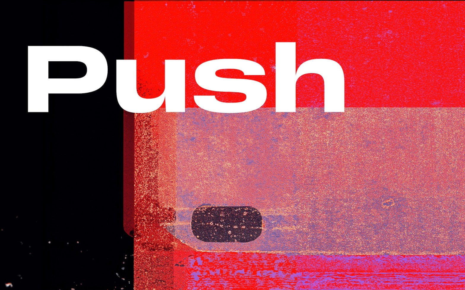
Push might draw from more than a century of sans-serif type design, but it stretches out with a modern perspective. Its simple, slim, open forms evoke American Gothic typefaces and provide the perfect foundation for Push’s charming and curvaceous Grotesk quirks.

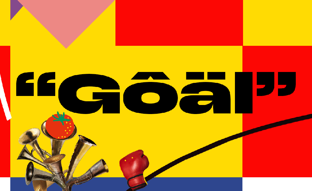
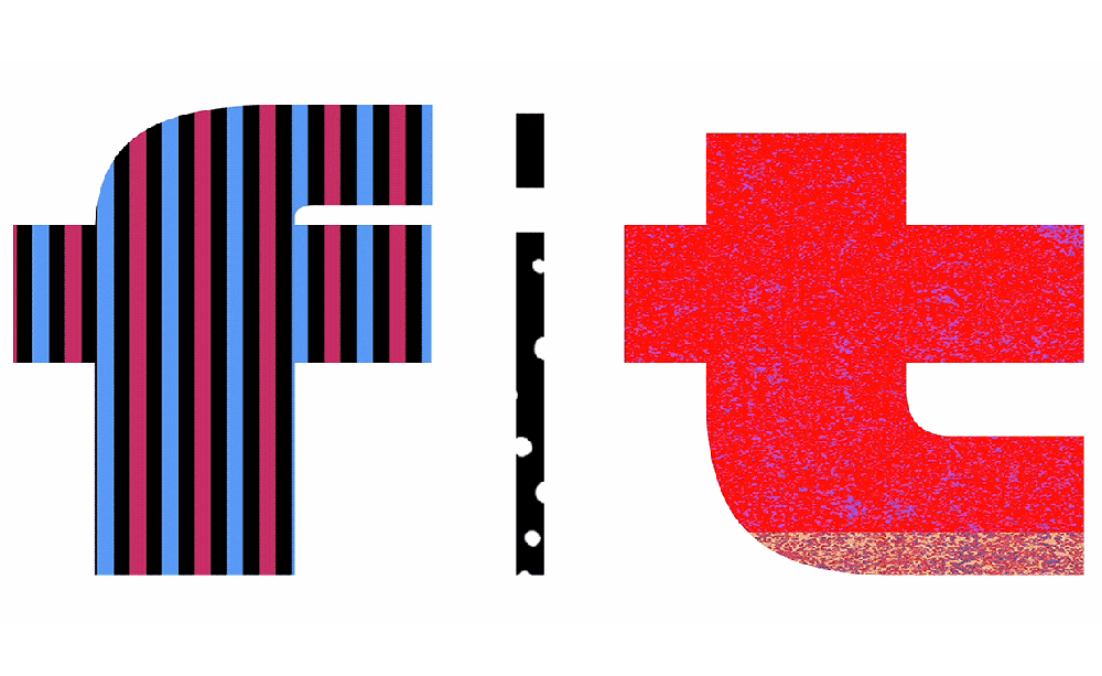
Push’s visual character and personality shine through in the spacious counter of the capital ‘G,’ inspired by Thorowgood’s Seven-Line Grotesque (1830), and a lowercase ‘a’ (reminiscent of Plak, 1930) that presents as both squat and tall. Speaking of the letter ‘G,’ there’s also a looped American version, an open-looped Danish version, and a two-story Grotesk in the lowercase set.

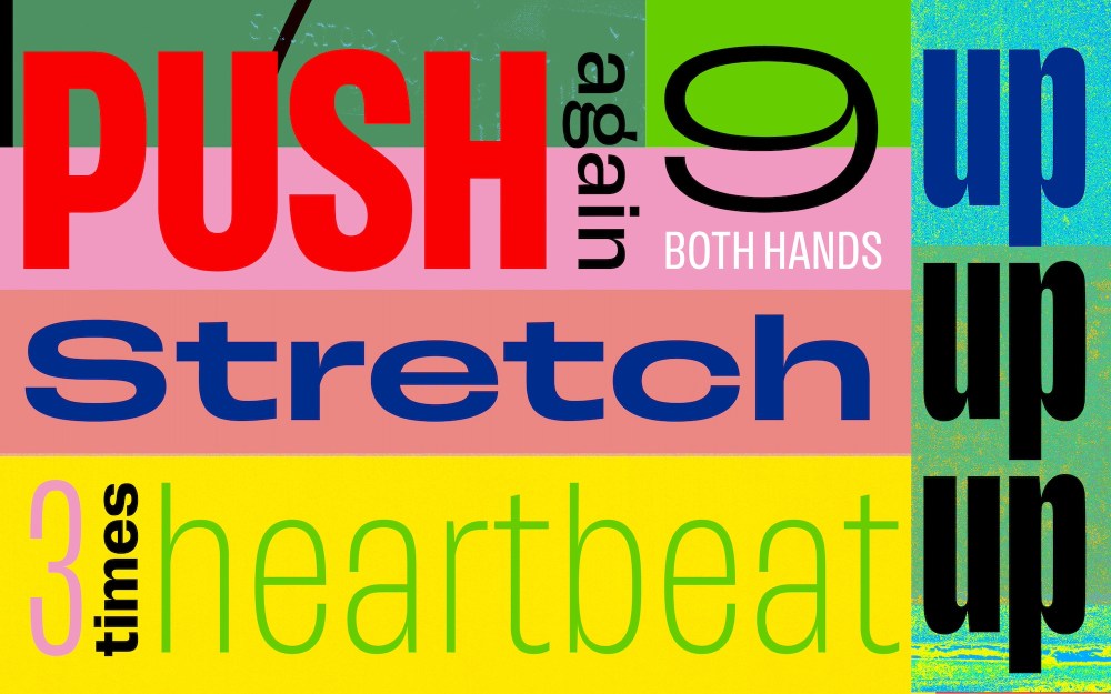
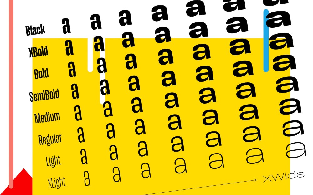
Across its eight weights, seven widths, and 56(!) styles, Push showcases a blend of the Old and New—a type chameleon for the designer’s toolbox. The range of possibilities across the width, weight, and shape spectrum gives designers typographic versatility for today’s multifaceted, complex, and multi-media brand applications.
Push was created by Swiss designer, Christine Gertsch out of Fontwerk, a Berlin foundry known for helping brands stand out with type.
Drawing the best from the past century of type design, Push has been a labor of love to create a typeface that works hard under any conditions and will endure the test of time.
Christine Gertsch
Fontwerk tapped Rocket & Wink, a design-art-graphic-brand-bureau-agency-whatever (their words) from Hamburg, Germany, to create a video campaign that showcases Push in all its glory.