Helen Kilness and Jene Crenshaw were the founders of Summit Magazine, the first U.S. monthly climbing magazine, which ran from 1955–1996. In the beginning they worried that readers might not purchase an outdoor magazine run by two female publishers, so they listed themselves as “J. M. Crenshaw” and “H.V.J. Kilness” on the masthead. Later, Crenshaw switched to “Jene M. Crenshaw” (which, to her, sounded less feminine than her given name, “Jean”). Kilness continued to use her initials and last name. “It was a man’s world [in the ’50s],” Crenshaw told Alpinist Editor-in-Chief Katie Ives in 2014. “I didn’t resent it. It was just the facts of life.” Kilness died in 2018 at age 96. Crenshaw died in 2019, at age 95.
For over 40 years Summit Magazine was a top periodical in its genre. “And its impact was—and continues to be felt—well beyond the climbing world, in large part due to the avant-garde aesthetic that Jean and Helen cultivated with the Summit‘s covers: sometimes chic, sometimes stark, sometimes playful,” says Michael Levy, its new publisher and editor-in-chief.
This spring, a refurbished Summit Journal (issue 320) was reborn as a print-only, biannual, oversized, coffee-table-quality magazine devoted to longform storytelling and large-format photography. The first issue came out in February, and the next is due in August. Previously, Levy spent five years working for two other outdoors magazines, Rock and Ice and Climbing. As has happened with so many other print properties in recent years, the print editions of those titles “went the way of the dodo.”
“As someone who loves print as a medium for longform storytelling, it seemed like the perfect time to take a crack at starting a new print magazine,” Levy says. “Rather than start a brand new magazine, though, I loved the idea of breathing new life into a historic title. Summit, in the climbing world, is as historic as it gets.” He acquired the rights in February 2023, and put out the first new issue in over 27 years.
Here he talks about his climb back up the summit, as well as some of the covers art directed by Kilness and Crenshaw, who have been unheralded in the history of magazine design.

Why have you revived the magazine as a journal in print only? Doesn’t that seem to be counter-intuitive?
On its face, there’s definitely something counterintuitive to being print only. But in another way, it seems exceptionally rational to me? That is, if you can get the material in the magazine online, doesn’t that decrease the perceived value of the print product?
My feeling is that with the glut of content online, there’s something to be said for a highly curated physical product. There’s so much out there on the internet that a lot of stuff, much of it quite good, just gets lost in the noise. But something tactile that you can feel between your fingers and read over a cup of coffee or a beer, that prioritizes longform … it might not reach as many people, but the people it does reach will be that much more invested. Print feels a bit like vinyl to me; what’s old is new again, and the collectability of it, the quality of the physical thing itself, is important. Just like vinyl isn’t going to replace Spotify, print isn’t going to replace digital, but there is a very real audience out there (and I’m in it) that likes analog media, and appreciates reading things that aren’t on a screen.
And building off that, print also felt like a more achievable business model, in a strange way. Though print has a higher bar to entry–the hard costs to get it off the ground were greater, and if I didn’t attract enough subscribers, the whole thing would have been dead on arrival–once cleared, the way forward felt much clearer. You can only fill a magazine with so many articles, after all.
Of course, I’m a storyteller: What matters most to me is pursuing quality longform journalism. If the articles and image curation inside the magazine are no good, it’s not worth the paper it’s printed on. But given what I think is the extremely high quality content we have managed to fill the magazine with, my feeling is that the exterior should match.
The magazine was founded by two committed climbers. Tell me a little about their goals and feats of magazine publishing.
Jean and Helen were trailblazers, plain and simple. … They were iconoclasts.
Jean and Helen were serious and eminently capable climbers. They lived in Big Bear, CA, in the San Bernardino Mountains, and would head out for adventures in the mountains, and climb at smaller cliffs close to home. Another fun story: Sometimes, so busy were they with their adventuring, they’d forget what issue number they were on, so there are a couple of the old ones that have the same month!
In the hundreds of issues they published, they were actively shaping the culture of the nascent sports of rock climbing and mountaineering in the U.S., pursuits that had a longer history in Europe. In addition to publishing the essays and accounts of cutting-edge ascents by the best climbers of the day—guys like Yvon Chouinard and Royal Robbins, who are household names today—they also published trip reports by families out in the hills or on a fishing trip. They cultivated an egalitarian ethos with their magazine, in content and authorship, publishing an outsized number of women.
What do you think is or are the most significant graphic element(s) of the magazine in its original form and format?
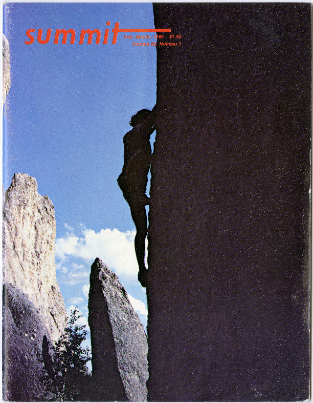
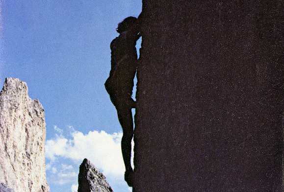
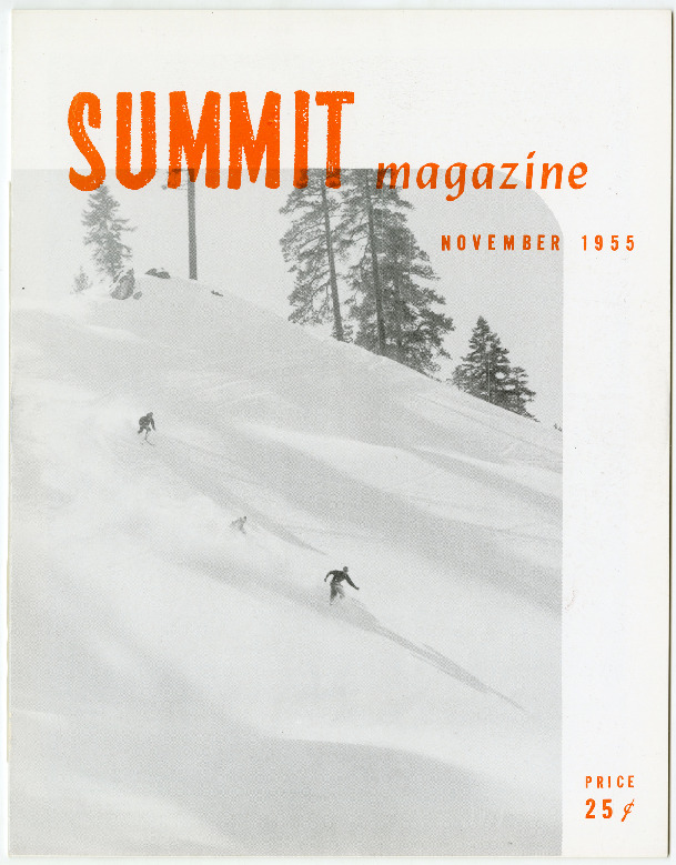
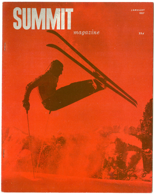
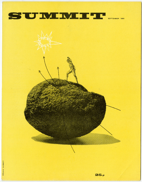
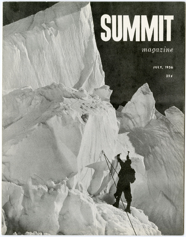
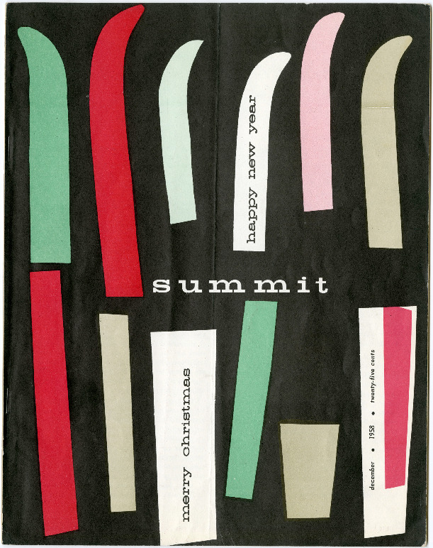
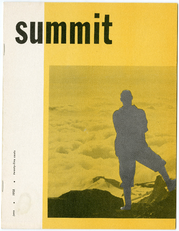
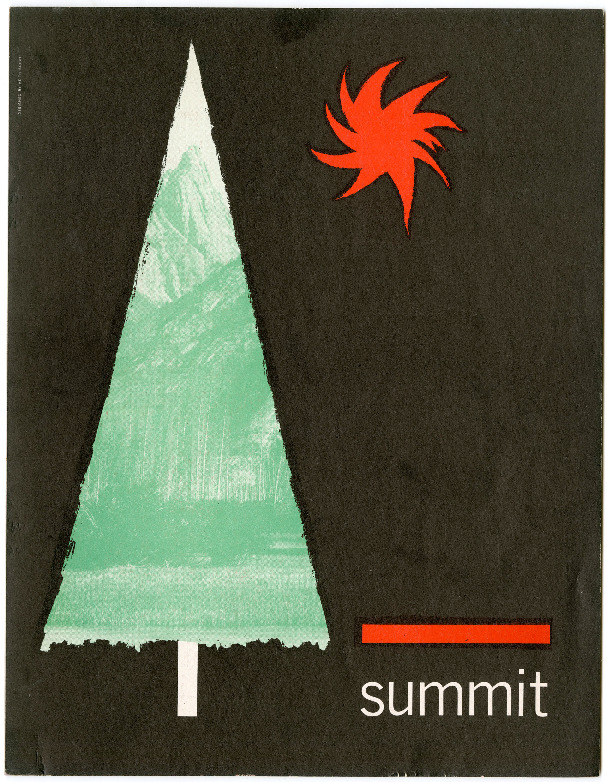
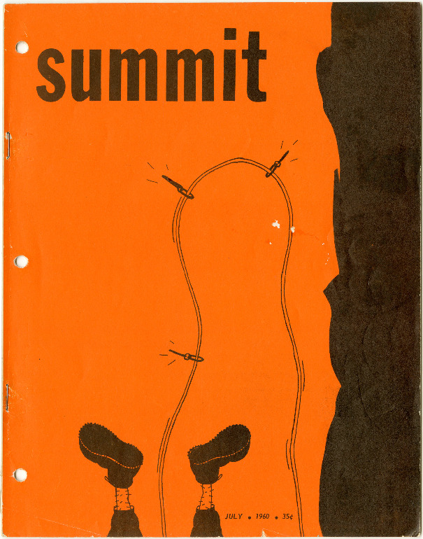
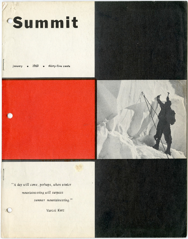
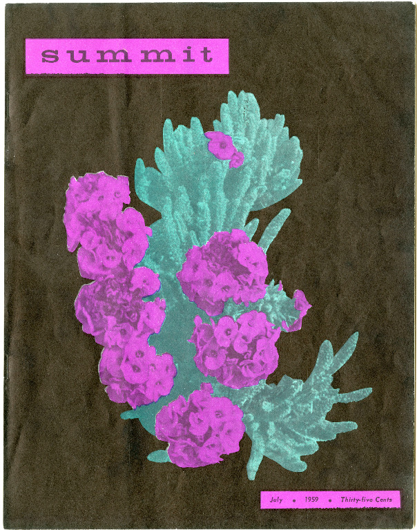
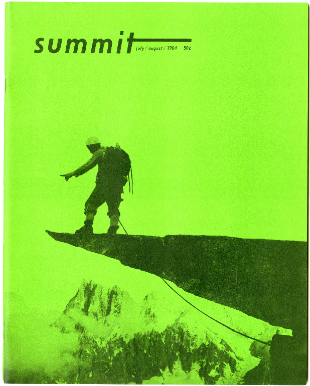
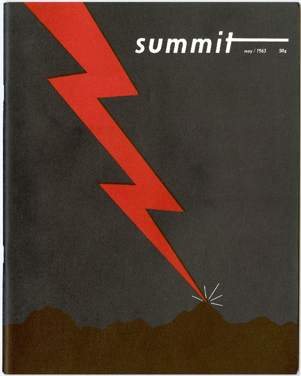
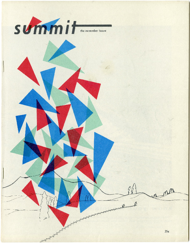
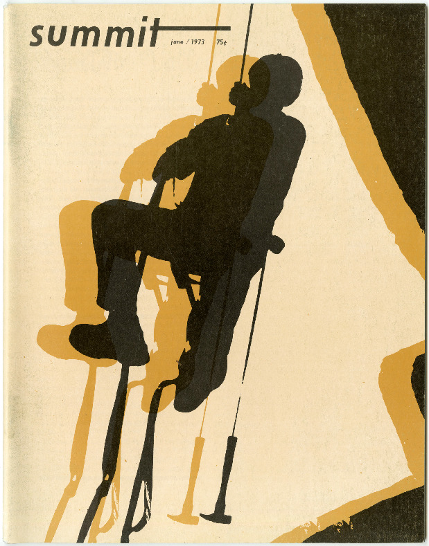
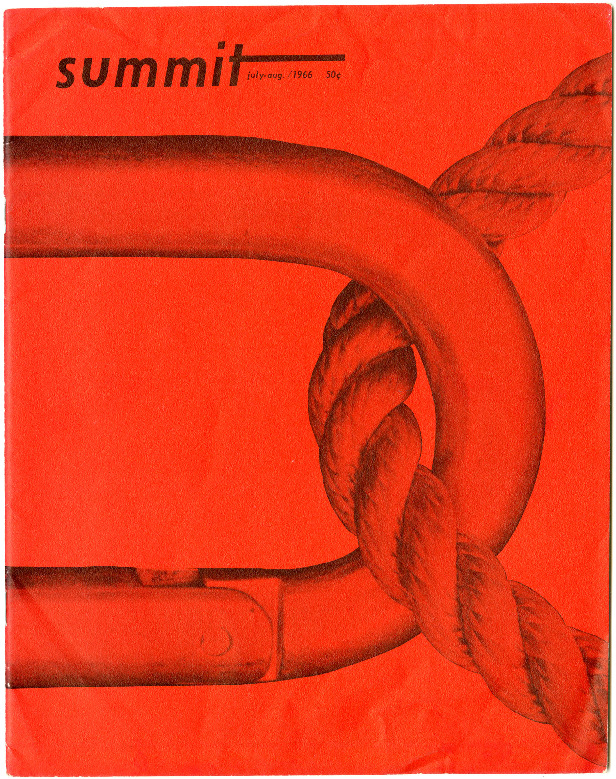
Summit’s old covers are just so distinctive. Particularly in the 1960s, they had a really bold aesthetic, combining bright colors, illustration, playful geometric shapes and different media. Most of the covers are devoid of coverlines, and many have a very minimalist look, e.g., a single pinecone against a blue background, or a silhouetted climber on a cliff against a bright yellow background. My favorite cover is probably September 1967: a minimalist illustration of a lone figure silhouetted on a hill looking up at the night sky. It’s beautiful in its simplicity.
They also used color in paradoxical ways—e.g., a mountaineering scene bathed in neon green or neon pink—and sometimes used ultra close-up shots—e.g., one section of a climbing rope.
One of the cool things in resurrecting the magazine has been to see how far its legacy extended beyond the fairly insular climbing world. I’ve had a whole host of people from the design world reach out to me to express their love and affinity for the old covers and their style.
What have you done to bring it valiantly into the 21st century?
One of the fun parts of reviving an old magazine versus starting one from scratch is that we can lean into the old stuff. The new Summit very much has one eye on the past, while also keeping one eye on the present and future. One example of this: For our debut issue in February, we had two covers. One was an illustration, one was a photo. The illustrated cover, by a great young French artist named Thomas Danthony, was very much an homage to Summit’s covers in the ’60s. The photo cover is very much a splashy, modern climbing photo, full of motion. The stories inside reflect this duality too: We publish both modern reportage, and stories about the history of climbing and climbing culture.
Physically, the magazine has also gotten a big overhaul. The new version is 10″ x 13″, so quite large. It’s printed on heavy stock, uncoated paper. It feels closer to a coffee table book than a newsstand magazine.
In terms of the aesthetic, the inside has what I’d consider a pretty modern look overall: Most of the imagery is displayed in full-page or spread format to really take advantage of the magazine’s size. My art director, Randy Levensaler, has been working on print magazines for decades, and has an incredible eye for effective yet eye-catching layouts
That being said, in terms of the text, we’re very much charting a classic look. I can’t tell you how much Randy stressed over the font choices, text size and spacing—and I think it shows.
We also retitled it as Summit Journal. For six years in the 1990s, after Jean and Helen sold the magazine, it was rebranded as Summit: The Mountain Journal. It closed up shop in 1996, and hasn’t been published since. So going with Summit Journal felt like a way to nod to both former iterations of the mag, yet once again signal that this is a new magazine for a new era.
Do you have to be a climber to be a reader?
Definitely not. I myself am a passionate climber, but at the end of the day my mission is to fill Summit Journal’s pages with quality journalism, photography and art.
The best piece in the first issue is by a brilliant young writer named Astra Lincoln, and it is about the advent of photographic surveying in the Canadian Rockies at the turn of the 20th century, and how this a) led to a boom in mountaineering, and b) is also inextricably related to episodes of ethnic cleansing in the area. It’s masterful.
Some of what we publish is surely a bit lingo heavy, but most of it, I’d say, should be totally accessible to the non-climber.
What is your longterm goal for Summit?
To make a magazine that people want to keep on their shelf to read and flip through again and again over the years.