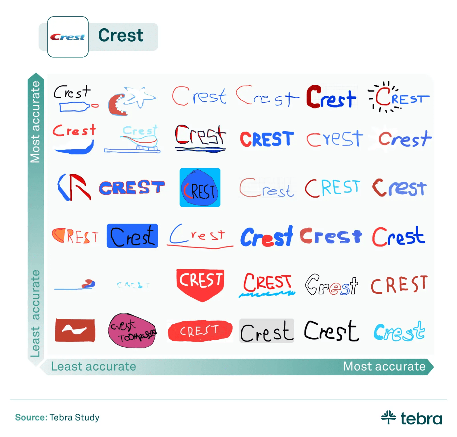
Would you be able to draw the logo of the brand of your toothpaste from scratch? What about the logo of your go-to, over-the-counter pain medication? These are the questions the healthcare research company Tebra has been asking, in their pursuit to figure out which brands in the industry are most identifiable and memorable.
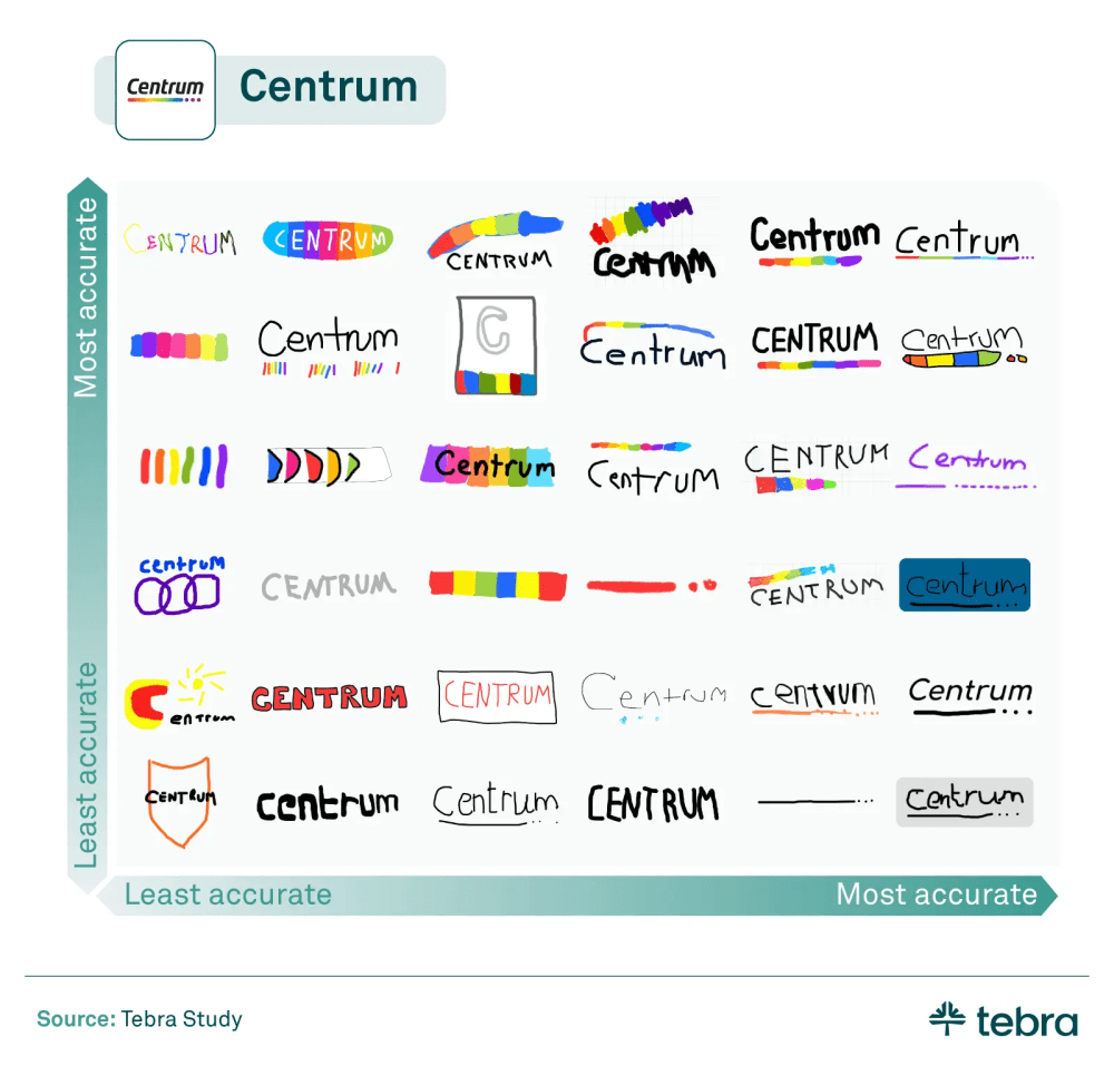
As part of one of their most recent studies, Tebra surveyed 1,005 adults about their ability to recall, identify, and draw healthcare brands. In doing so, they also asked a subgroup of 111 respondents to draw six healthcare logos from memory.
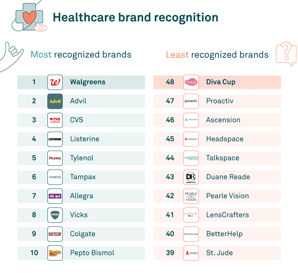
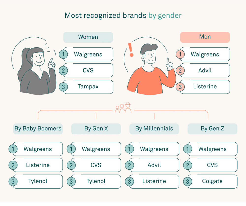
What did they find? For starters, Walgreens proved to be the number one most well-known healthcare brand, across genders and generations, with Advil and CVS following close behind. Tylenol was found to be the most identifiable pain reliever among Baby Boomers and Gen X, while Advil was most identifiable among Millennials and Gen Z. Unsurprisingly, women identified menstrual care brands 2x better than men, and skincare brands 2.3x better, with 62% of men surveyed able to identify the Tampax logo.
But what do the findings from Tebra’s study actually mean in the bigger picture? What can designers and brand builders in the healthcare space glean from this survey and put into practice? We asked a member of the Tebra creative team, Rachel Kirsch, a few questions to elaborate on their results.
What are the main takeaways from the results of this survey? What do the results tell us about successful (and unsuccessful) healthcare branding?
The results of our survey illuminate a pivotal aspect of successful healthcare branding: the power of distinctiveness and familiarity.
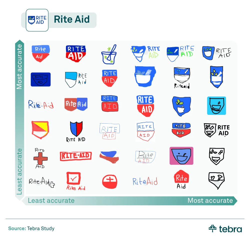
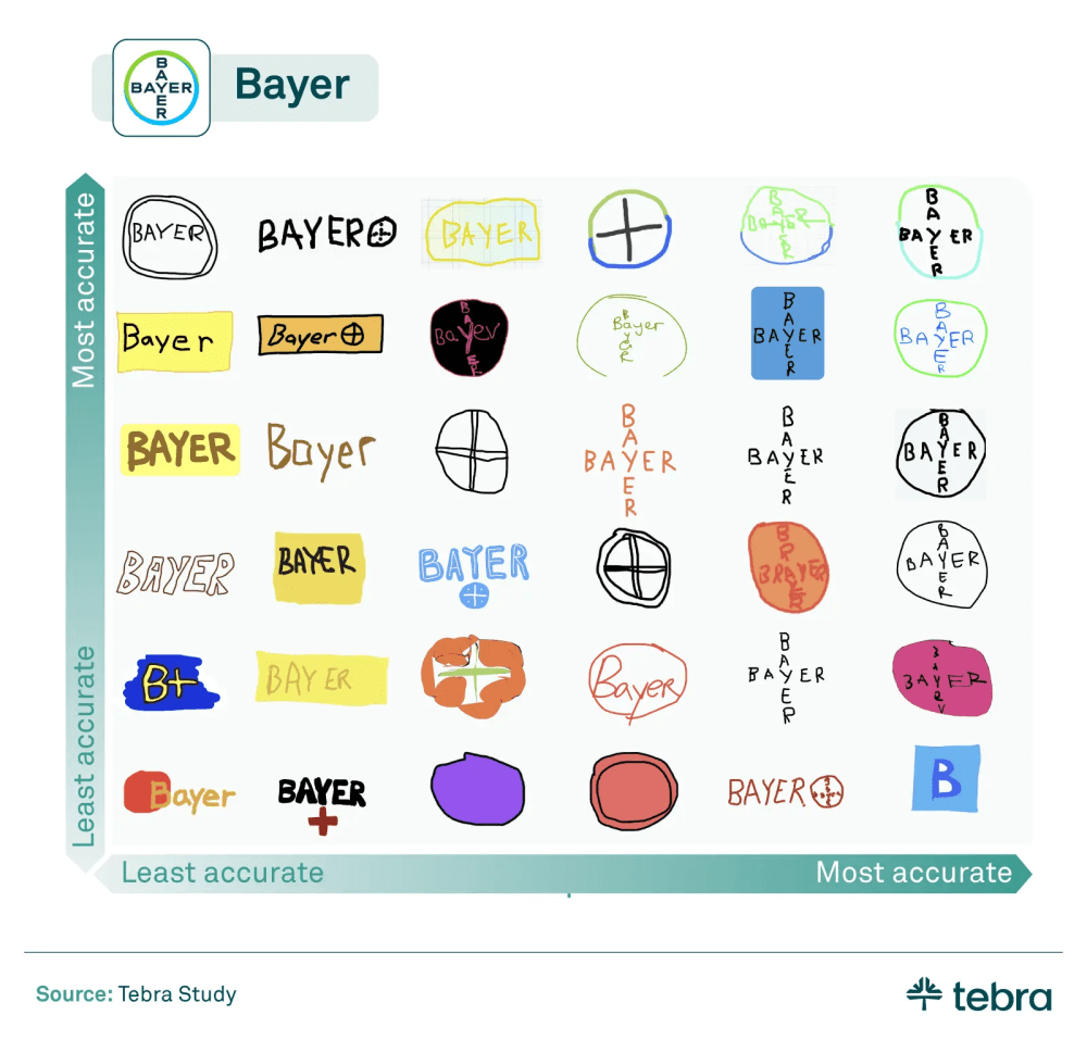
Brands like Walgreens, Advil, and CVS, with their easily identifiable logos, stand as testaments to the effectiveness of branding that cuts across various demographics, proving memorable across genders and generations. On the flip side, the struggle of brands like Bayer and Rite Aid to make their new logos resonate with consumers highlights a crucial pitfall in healthcare branding—changes in branding, especially those that significantly alter the logo’s appearance or color scheme, can dilute brand recognition.
Successful branding, therefore, hinges not just on visibility, but on creating a durable and distinctive identity that resonates with and remains memorable to the public.
Based on your results, what should designers and brand-builders in the healthcare space try to emulate and inversely, what should they avoid?
Our study offers a clear directive for designers and brand-builders in the healthcare space: prioritize uniqueness and consistency.
The memorability of Allegra’s purple logo in a sea of blue and green allergy medications, and Pepto Bismol’s standout pink, underscore the value of choosing distinctive colors and designs that set a brand apart from its competitors. Conversely, the survey results suggest a cautionary tale against frequent or radical rebranding efforts, as seen with Bayer and Rite Aid, where respondents clung to the legacy branding.
This affinity for the familiar emphasizes the importance of consistency in logo design and the risk of alienating consumers through significant branding overhauls.
What’s the most surprising aspect of the survey results?
Perhaps the most surprising revelation from our survey was the broad recognizability of the Tampax logo among men, with 62% able to identify it correctly. This insight challenges conventional marketing wisdom about gender-specific product branding and suggests a wider cultural penetration of brands traditionally marketed towards women.
Additionally, the significant generational divide in digital healthcare services recognition, with Gen Z far more likely to identify online mental health providers like Calm and BetterHelp, points to a rapidly shifting landscape in healthcare consumption and the increasing importance of digital platforms in providing health services to younger demographics.
