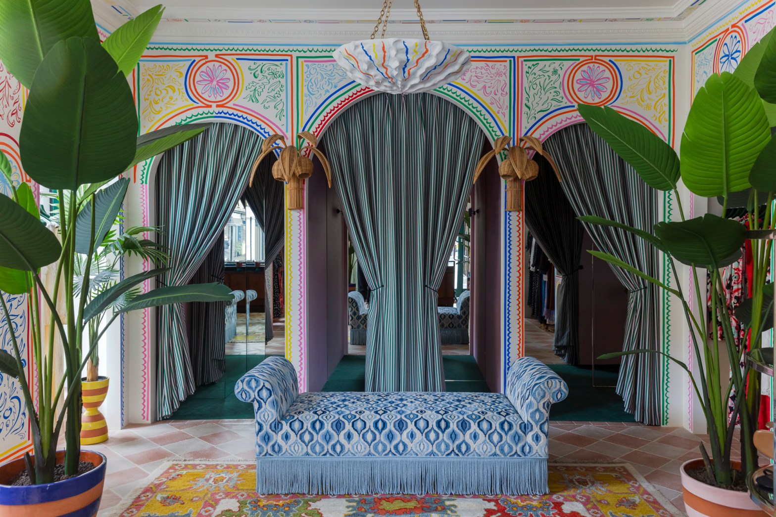
As an avid shopper and someone who’s worked at many a small business, I am fascinated by well-executed and beautifully designed brick-and-mortar store concepts. At a time when the ease of online shopping has taken over our general consumer experience, I hold strong as an advocate for shopping at actual, physical stores in real life, feeling, touching, and smelling the goods, and taking in the space. Any items purchased represent just a portion of the holistic shopping experience, which is equally composed of the people I’m shopping amongst and interacting with, as well as the thought and consideration that went into the store’s vibe and feel. These intangibles make shopping not just an economic exchange but a moment for human connection and memory-making.
That’s why when I came upon photos of the new RIXO location in the Marylebone neighborhood of London, I was instantly captivated and had to learn more about the unique design concept and those behind it.
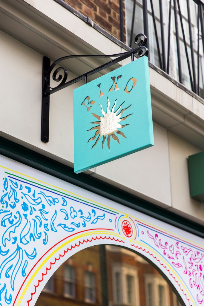
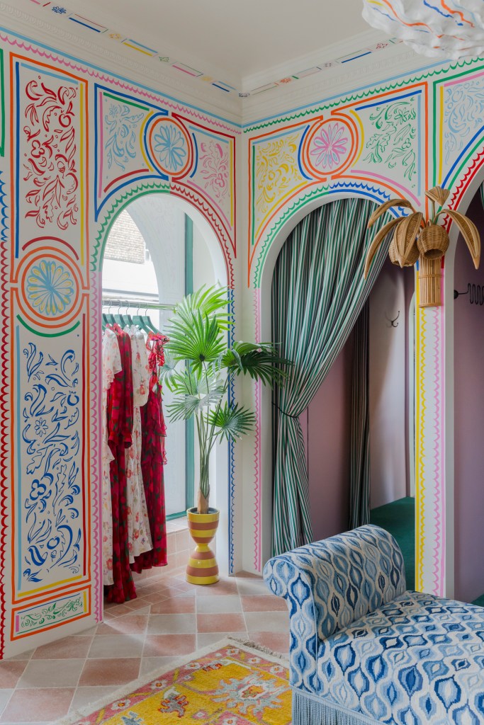
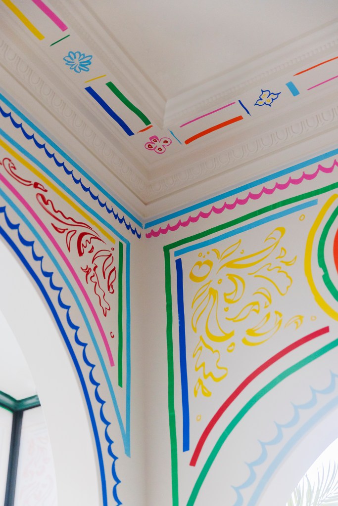
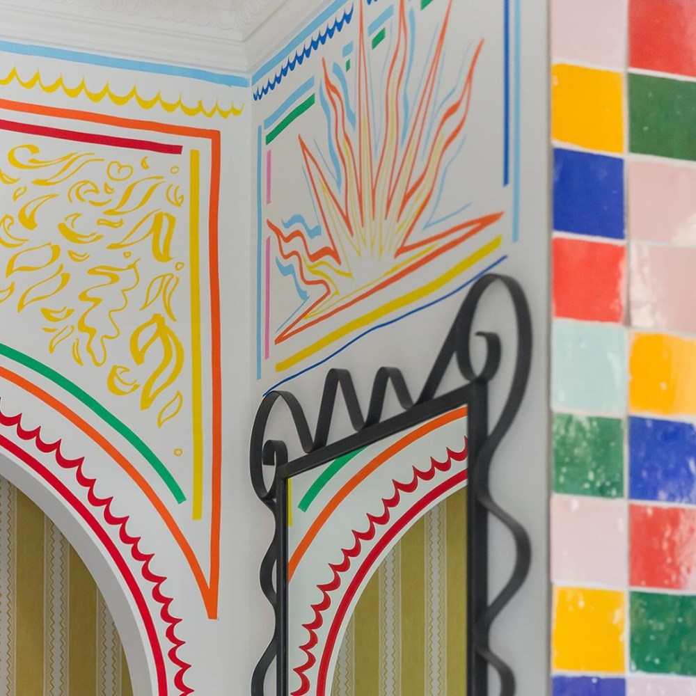
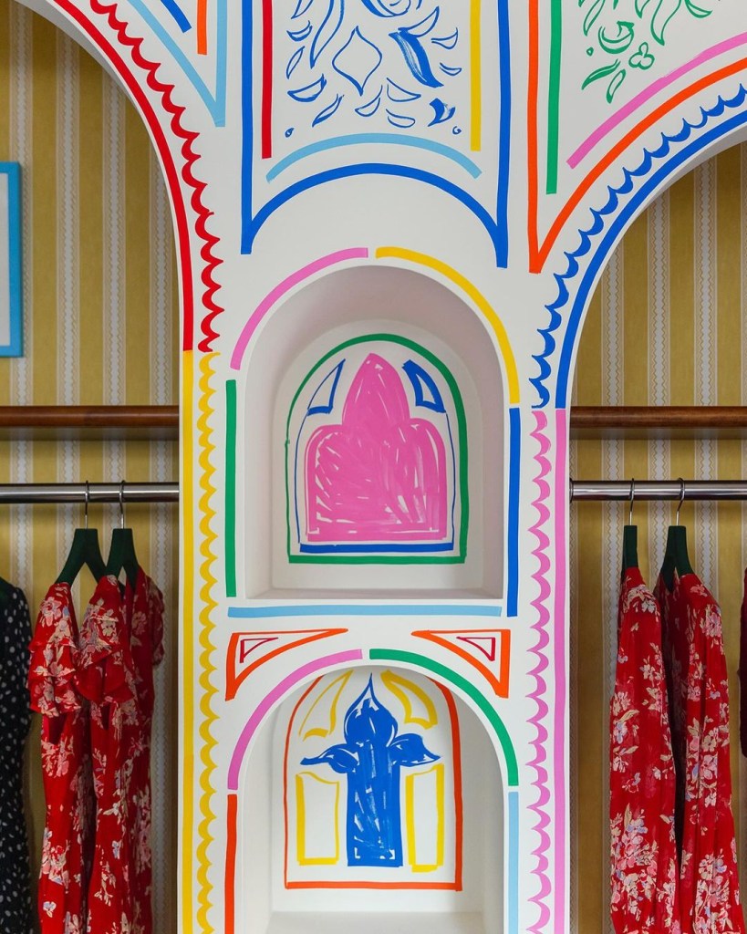
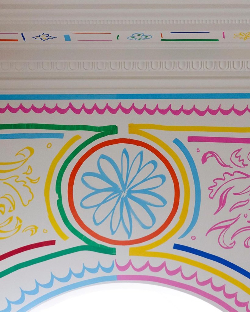
RIXO is a contemporary clothing boutique specializing in bohemian sundresses and vibrant prints. Their new Marylebone location brings the whimsical energy of their clothing to life, with brightly colored architectural motifs organically illustrated all over its otherwise crisp white walls. The saturated color palette and hand-drawn line quality create a pop-art-like look, infusing the space with a playful take on classical design elements. Illustrator Sam Wood developed this aesthetic in partnership with the design studio Cúpla, helmed by Gemma McCloskey. I reached out to Wood and McCloskey to learn more about the process behind their design concept and what it was like bringing such a fresh take on retail space to fruition.
(This interview has been lightly edited for length and clarity.)

What was the development process like for this distinct store design concept?
Sam Wood: The initial process was driven by Gemma. She approached me after seeing some of my work with Claridge’s and other clients in the UK and asked me to devise something bold and colorful that told the story of RIXO in a distinctly new way.
GM: When I first stumbled across Sam’s Instagram page, his use of color felt really bright and fresh alongside his beautiful, fluid style. I knew instantly Sam would be perfect for the new Marylebone RIXO; his handwriting lent itself to enveloping the whole space while still allowing it to breathe.
SW: After I had taken a look at the other RIXO stores and got a feel for their story, it was a pleasure to bring something of Marylebone to the space and interpret that in my own line. I spend a lot of time in the area because a local gallery I work with is down the road, so I’m always roaming about looking at the mishmash of architecture from Gothic Revival (which was the basis of the alcoves) to Neoclassical (which was the basis for the floral details). I hope the eventual style reflects the multiplicity of the area and is a playful reference to how I see things existing alongside each other.

What was the rest of the collaboration process like?
GM: We had an initial meeting where I discussed the concept, design, and materials being used in the space. One of the threads from our concept for Marylebone was this nod to classical London architecture; therefore, creating illustrated paneling with a whiff of Jean Cocteau was the foundation of the design. Within this framework, it was important to give Sam the breathing space to be creative, and it was exciting seeing him embrace the concept and bring his own stamp to the design.
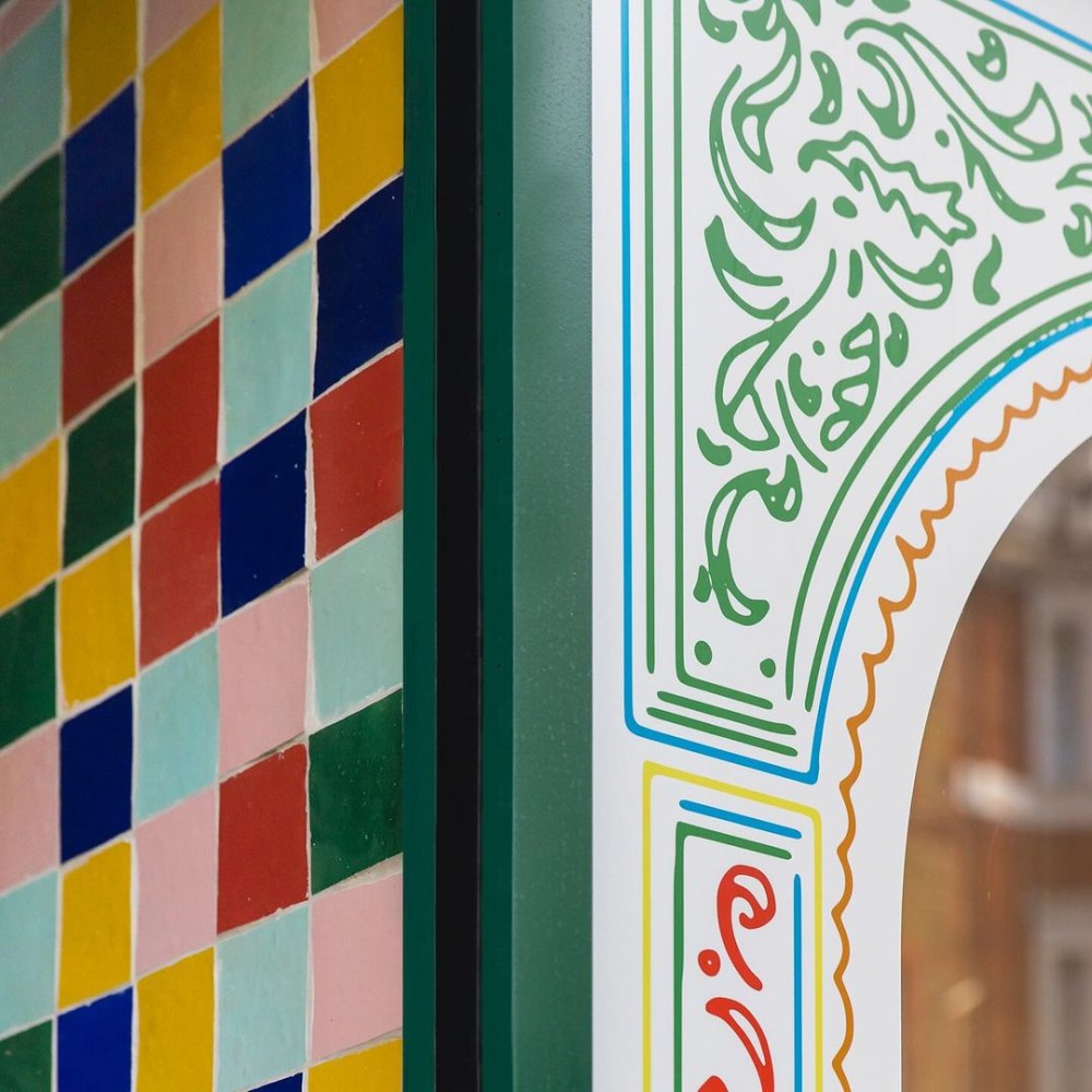
Once we had reached the final internal designs, we decided we needed to use these on the external windows to fully embrace the concept. When Sam was actually onsite doing the mural, it was a very fluid process, and we would discuss colors and tweak a few things with the benefit of actually being in the space. We also added in some of the pendants which sit centrally in the space and look great.
Did you first map out the design digitally and then bring it to life on the store walls? What was it like free-handing the motifs? Nerve-wracking, exhilarating?
SW: I am a stickler for being analogue early on; I work on full-scale drawings on paper, which gives me an idea of how the motifs will work at scale as well as the tones and quality of line. The client does not always see these, but they are an essential part of how I conceive of a design and have the confidence to execute it. After this, I can mark up the digital renders to hone the design so the client can get a full idea of the vision.
A great deal of forward planning and preparatory drawing goes into making sure that when I put the pen on the wall, it’s all where it should be. That’s an essential collaborative exercise, in this instance, with Gemma, who was fantastic to work with. Building sites are often chaotic places, which is a far cry from my day-to-day in the studio, so yes, it’s a heart-in-mouth moment every time with the first mark on the wall, but I do get a kick out of it!
Is this markers-on-walls technique a style you’ve done before? Or was it specially created and executed for this particular project?
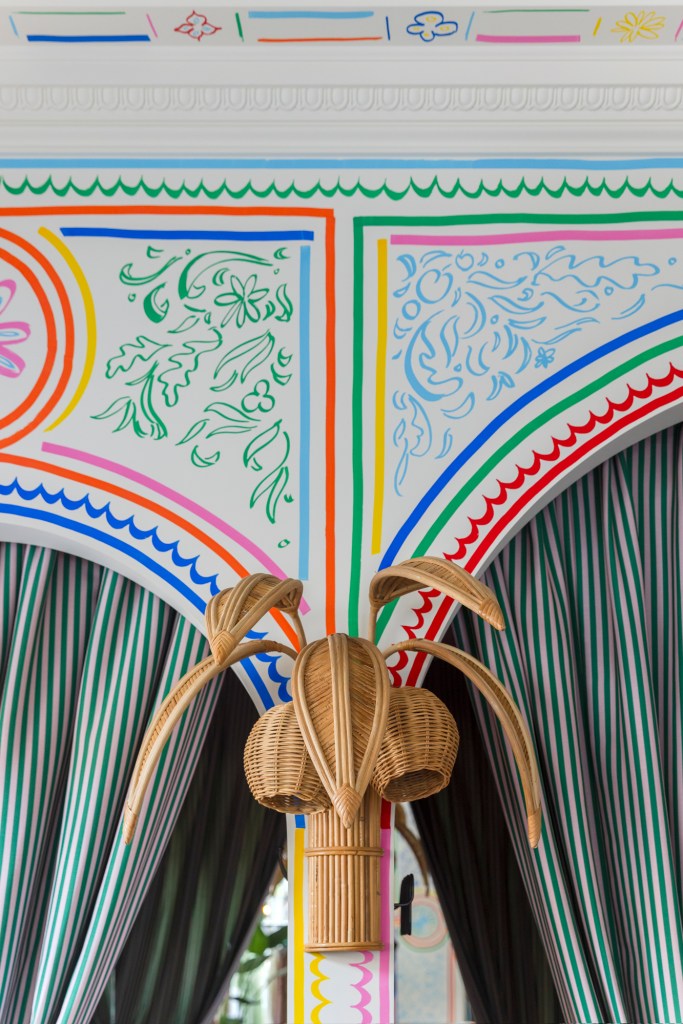
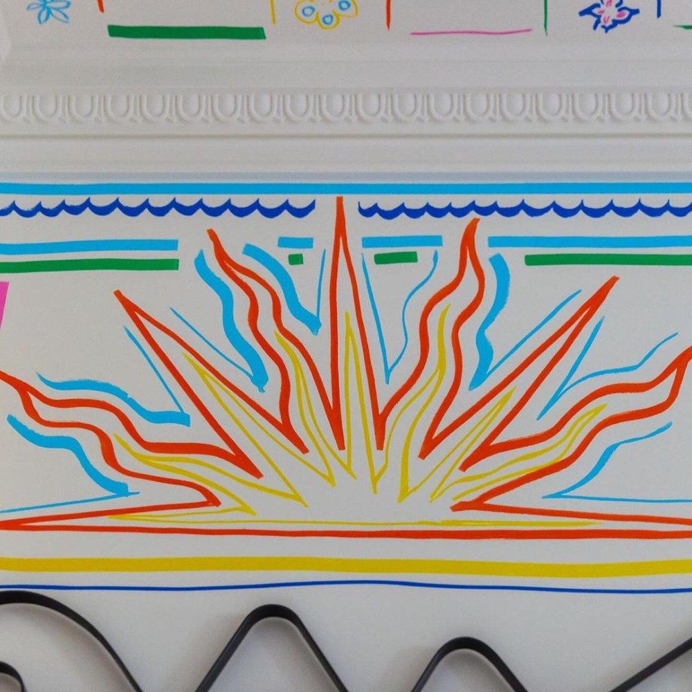
SW: I’ve used Posca markers for years in various contexts, they have such a nice uniformity of tone, which is ideal for bringing to life a design which needs to keep its clarity and “poppyness.” I used them for the first time in a mural context last year for Bryan O’Sullivan Studio, painting a celestial ceiling which is still on show in their gallery on Brook Street Mayfair.
Ordinarily I use a brush and acrylic when doing murals, so it was fun to what is possible with these works in the medium.
How did you feel at the end of the process after drawing your last line, stepping back, and seeing the completed store?
SW: It’s always a moment of thinking, “Is it finished now?” There’s always the possibility of another line, filling out this corner, or changing that line. I habitually look for flaws in a work, and the “finished product” is always an opportunity to see how everything has worked together. It’s a strange feeling to hand the thing over— after a couple of days of the room being yours, it now belongs to the client and, of course, the public, who interprets it in their own way. That’s why I love working so spatially— the works sometimes divide people, but once I’m finished, that’s down to the viewers.
What sort of experience do you hope shoppers have when stepping into this RIXO store? What sensations do you hope they feel as they move about the space you all created?
SW: So much of what I do is about storytelling and creating places where people can escape in some way. Here, the murals are front and center in the design and are a key part of the store’s identity. I hope anyone coming into the space gets a sense of the layers of detail that go into evoking the story that RIXO wants to tell, as well as how my own journey as an artist marries with that.
GM: We want the shoppers to feel invited like they’re stepping into someone’s living room at home. We didn’t want a sterile interior, which can sometimes be intimidating for a shopper. There is also a sense of escapism with the store, which we hope the customers find uplifting.
