
For Italian type nerds, 2020 was not only the year of the pandemic, but it also marked the 100th birthday of Aldo Novarese, Italy’s most famous type designer.
Novarese's exuberant passion for the re-invention of traditional letterforms and his relentless exploration of typographic possibilities were celebrated by an exhibition held in Tipoteca and through a successful Kickstarter re-edition of his masterpiece, Alfa Beta, edited by Archivio Tipografico.
But the craziest homage to Novarese was the football poster design tournament Coppa Stadio, organized by Zetafonts Foundry for a revival of the typeface Stadio, a long-lost classic designed by Novarese in 1974 and published only as dry transfer lettering.

Zetafonts’ typographic treasure hunt for Stadio began with a visit to Archivio Tipografico, a collaborative space for the preservation, study, and practice of the typographic arts. Located in Turin, the Archivio is proudly preserving the heritage of the Nebiolo foundry that dominated the type design scene in Italy in the last century and that Novarese had joined when he was only 17 years old.
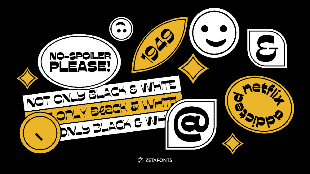
In the Archivio Tipografico, Cosimo Lorenzo Pancini of Zetafonts discovered a rare copy of Novarese’s Il Segno Alfabetico. Edited by the typographer just a few years before his death, the book shows a complete collection of specimens of his most famous typefaces (like Eurostile, Estro, and Stop), as well as some more obscure ones with sketches and unpublished fonts. Pancini was immediately hooked by the design of Stadio, an extra bold grotesque typeface notable for its reverse contrast, with the horizontal lines being thicker than the vertical. Its bold and playful shapes well suited its name, literally meaning “football stadium” in Italian. Though drawn almost fifty years ago, it had the energy of today’s more trendy and experimental typefaces.

Stadio was also fascinating because no one had ever digitized it-it was only published as a rub-on transfer lettering in the R41 line by Reber, the Italian competitor to Letraset. Zetafonts’ team contacted the granddaughter of Reber's founder and now CEO and agreed on a collaboration for the return of Stadio. A digital revival meant the chance to give exposure to the original lost design by Novarese—with one of the weights being a very faithful digital replica of the 1975 original. On the other hand, Zetafonts proposed to expand the original design into a full typeface family, with various text and display weights and a variable version to fully explore its reverse contrast design space. Novarese had in his life continuously reimagined, reinvented, and expanded typeface ideas from the past, and Zetafonts thought it made sense to apply his method to his own work.


To bring Stadio into the 21st-century globalized world, Zetafonts decided to extend its glyph set to cover additional languages. After designing extended Latin diacritics, the next step was the development of Cyrillic glyphs, designed with the help of Vika Usmanova, who already had scored some dazzling Cyrillic reverse contrast craziness on her Geekette for TypeType. Now in the works are Arabic (curated by Rania El Azmi) and Devanagari, both posing unique challenges on how to translate Novarese’s reverse contrast logic into different writing systems. Devanagari Stadio, designed by Shrishti Vajpai, looks fascinating as the top line becomes a massive black sign dominating the letter shapes.


To launch the typeface, Zetafonts decided to honor its vintage roots and the football fandom its name evoked, inviting twenty Italian graphic design studios and digital illustrators to play with Novarese’s letters to create a poster dedicated to a football team from their home region. A championship was then held on Zetafonts’ Instagram channel, allowing followers to vote for the outcome of each match.

The result was an inclusive and playful championship between Italy’s regions, where first league top teams played alongside lesser-known clubs and even imaginary ones, including Nebiolo’s own soccer team. The specimen of the typeface became a sports tabloid, collecting the posters and the commentaries, and available on Zetafonts site as part of a limited collector edition of the typeface that included a fan scarf and the original R41 transfer sheets of Stadio.


Original Design: Aldo Novarese
Design Team: Cosimo Lorenzo Pancini, Andrea Tartarelli, Francesco Canovaro; Vika Usmanova (cyrillic), Rania Azmi (arabic), Shrishti Vajpai (Devanagari).
Type Foundry: Zetafonts
Release date: December 2020
Weights: 12 weights + 12 Italics + 2 variable fonts
Author: Cosimo Lorenzo Pancini – Zetafonts Partner and Project director. Cosimo bought his first typeface, an Arnold Boecklin Letraset transfer, when he was nine years old. He has since then kept playing with letters both written and drawn, working as a type designer, visual arts teacher, and art director for print, digital, and video. He has designed over fifty typeface families for Zetafonts Foundry that he co-founded with Debora Manetti and Francesco Canovaro. His typefaces include Cocogoose, Blacker, Monterchi (CA typography award 2020), and Stinger (CA typography award 2021). He lives in Florence with his wife, a cat named Bodoni, and too many books.
Zetafonts Foundry finely designs high-quality retail typefaces and provides custom font design services for commercial and institutional clients. The foundry creates meaningful typefaces with a clear “case of use situation” and a strong “problem-solving attitude." Its goal is to provide finely crafted and innovative yet solid design tools for graphic designers, art directors, and brand managers worldwide. Zetafonts team also promotes typographic culture through the organization of educational initiatives, talks, and courses.
Learn more on www.zetafonts.com